Attack On Titan Final Season: MAPPA’S Incredible Evolution From The Beginnings With Wit Studio
It’s been a few weeks now since the second part of Attack on Titan 4 no longer colors Sundays on Crunchyroll. The last episode of this story arc (here the review of Attack on Titan 4×28) sets the stage for the third and final part, scheduled for 2023. This year’s episodes have shown great potential. We are not only talking about the narration, the result of a brilliant mind like that of Hajime Isayama, but about the entire project of direction, photography, animation, editing and more.
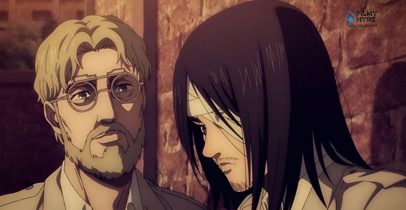
If you remember well a comeback of the series in a big way was hailed, and what had struck most was the evident leap in quality of the MAPPA study. The new episodes have revealed a more mature and more aware phase. But how did this come about? It will be useful to trace the evolution of the animation of Attack on Titan, from the dawn of WIT Studio until today.
Attack On Titan Final Season: A Distant Taste
When in 2013 the first season of the anime adaptation arrives on the small screen in Japan, the first episodes already show an unmistakable style. Much softer than Isayama’s drawings, WIT’s are soon a characterizing element of the anime. The faces of the characters appear well diversified and, above all, perfectly in line with the age of most of the protagonists. “Sweet” faces, with a soft and well defined line. Few contrasts, few shadows, full colors. The most spectacular moments are a great strength, fertile ground for sequences full of aesthetic virtuosity.
For example, Levi’s fight against Kenny and his henchmen is memorable: a tumultuous succession of juxtaposed shots that, at great speed, give a scene full of grandeur. This opportunity allows you to take advantage of the CGI for the background. The first hesitations emerge, however, when WIT decides to experiment with 3D animation for the Titan. The use of this technique radically changes the perception had so far, as well as the average quality of the product. Impossible not to remember a decidedly disproportionate Colossal and too mechanical movements. Nonetheless, the atmosphere that the previous animation studio creates for 3 whole seasons is quite homogeneous. Colors are too. Palettes with variegated, bright, bright colors rarely give way to other darker or dull ones. WIT, on the whole and despite its flaws, leaves a mark in Attack on Titan.
A Radical Change
When fans first witness the previously announced new style, opinions aren’t immediately positive. The change is clear, all too evident. The imagery that fans of the anime had had up to that moment completely disintegrates, creating initial inconsistencies. The characterization of the characters seems almost gone. Even with small flaws, enthusiasts have now grown fond of their appearance. Some, at first glance, don’t even look the same anymore. Once again, Captain Levi can be examined with his truly singular features: the eye with a small iris, a slender and angular face, a thin upturned nose. The new Levi becomes very different, with marked features, just like all the other protagonists. Comparing the characters of WIT with those of MAP, the trait becomes harder.
The shadows, which were previously made with solid and slightly darker areas of color, become very dark, sometimes consisting only of parallel black lines. In the first phase, which began with part 1 of the Final Season, the style seems very rough, dirtier and less defined. Another topic of discussion is, for a long time, the quality of the new CGI. Definitely a leap forward compared to WIT’s experiments, but overall still not entirely convincing. In short, MAPPA manages well to make people feel the lack of an aesthetic that, up to that moment, has been emblematic for the Attack on Titan anime.
The Mature Phase of MAPPA
However, something has recently changed. Those who harshly criticized the work of the new studio, with the second part of Attack on Titan 4 must change their mind. This year’s episodes are able to convey a series of messages through images. First and very close-ups with refined details, enriched and diversified palettes according to the moment and the narrative function. In this regard, the choice of a vast chromatic combination, proposed repeatedly, gives way to a different use of color: luminescent blue for the place of the Coordinates, red and brown before the Roar, only to return to polychromatic images in the second. part of this story arc. The return to the origins also influences the spectacularity of the anime, the result of a decidedly improved computer graphics but also of the much more fluid 2D animation.
In these last few episodes, it happens very often that scenes belonging to previous seasons are replayed in several flashbacks. It is really inspiring now to see how MAPPA has to pick up on WIT’s old works and adapt them to their own style without betraying the original shots. A good example is episode 79, especially the scene in Grisha’s memories in which little Eren is with his mother Carla. Through this comparison, it is possible to see how the radical change is a real upgrade. The faces, first of all, rediscover that characterization that, at the beginning of the fourth season, seemed to have been lost. There is a greater attention to detail, such as the more realistic rendering of the folds of Carla’s dress, or the areas of light and shadow on theher hair. Even the faces, always rather gloomy, present a more accurate study of the dark areas, preferring an increasingly marked line. This aspect involves almost all the characters; even Levi rediscovers his original form, visible in those few episodes in which he makes his appearance.
This style is perhaps more suitable for characters who, by now, are in a more mature phase of their existence. This new aesthetic, in some way, becomes the spokesperson for tiredness, suffering, gloom in this phase of the story, with hard and marked features typical of an adult face, marked by time and life experiences. Between sequences of deep emotional charge and breathtaking fights, MAPPA manages to balance two different lines: prefer the expressiveness and gestures of the characters or focus on action and spectacle. With a persistent reference to the first seasons, especially in the last episodes following the Roar and the numerous secrets revealed, the atmosphere of Attack on Titan returns almost to that of the past, between attack plans, hand-to-hand clashes and long sequences full of virtuosity.
The apparently less sought-after animation of the first part of the Final Season gives way to a strong dynamism, the result of a decidedly improved computer graphics but also of a much more fluid 2D animation. A useful yardstick is always that of the Titans, who now have a magnificent appearance to say the least, and whose movements are less cumbersome, increasingly camouflaging the difference that, in the past, was clear. In short, if first the passage from one studio to another seemed a very risky choice, with hindsight and with some improvements, MAPPA manages to win back its audience.
Anyone who reiterated as MAP has always approached the original drawings of Hajime Isayama, considered “dirty”, with those dark strokes and those dotted shadows typical of the fourth season of the anime. The style of the mangaka has certainly changed. From 2009 to 2020 Isayama’s exceptional improvement is more than evident over time and with a lot of practice. The second part of the Final Season sees many scenes reproduced in a more or less faithful way, sometimes sweetening the cruder ones present in the manga or representing them in different moments. A more accurate comparison, on a purely aesthetic level, always falls on the characters. Of some, such as Falco or Gabi, there is no WIT version in fact, and the similarity between the MAPPA representation and the original one can never pass through the intermediate one.
The speech changes for most of the cast; those frames that return in three different modes are emblematic, so that a more complete comparison can be made. Significant is certainly the scene of the first season in which Eren is carried away on his shoulder when his mother is devoured by the Smiling Titan, then re-proposed in episode 87. The shape of the eyes, the hair, the expressiveness of the face: MAPPA manages to bring back Isayama’s style excellently on the screen, and it is perhaps precisely the total detachment of the first animated adaptation that underlines its fidelity which, in this case as in many others, is truly indisputable. The new animation studio, therefore, not only gains more and more admirers with its latest works, but can also satisfy those who have approached, first one of the most successful manga.


